

1
2
3
4
5
6
7
8
9
10
11
12
13
14
Branding Project Alignment
Aligning both the business and project goals is vital in order to stay cohesive with the brand strategically and visually.
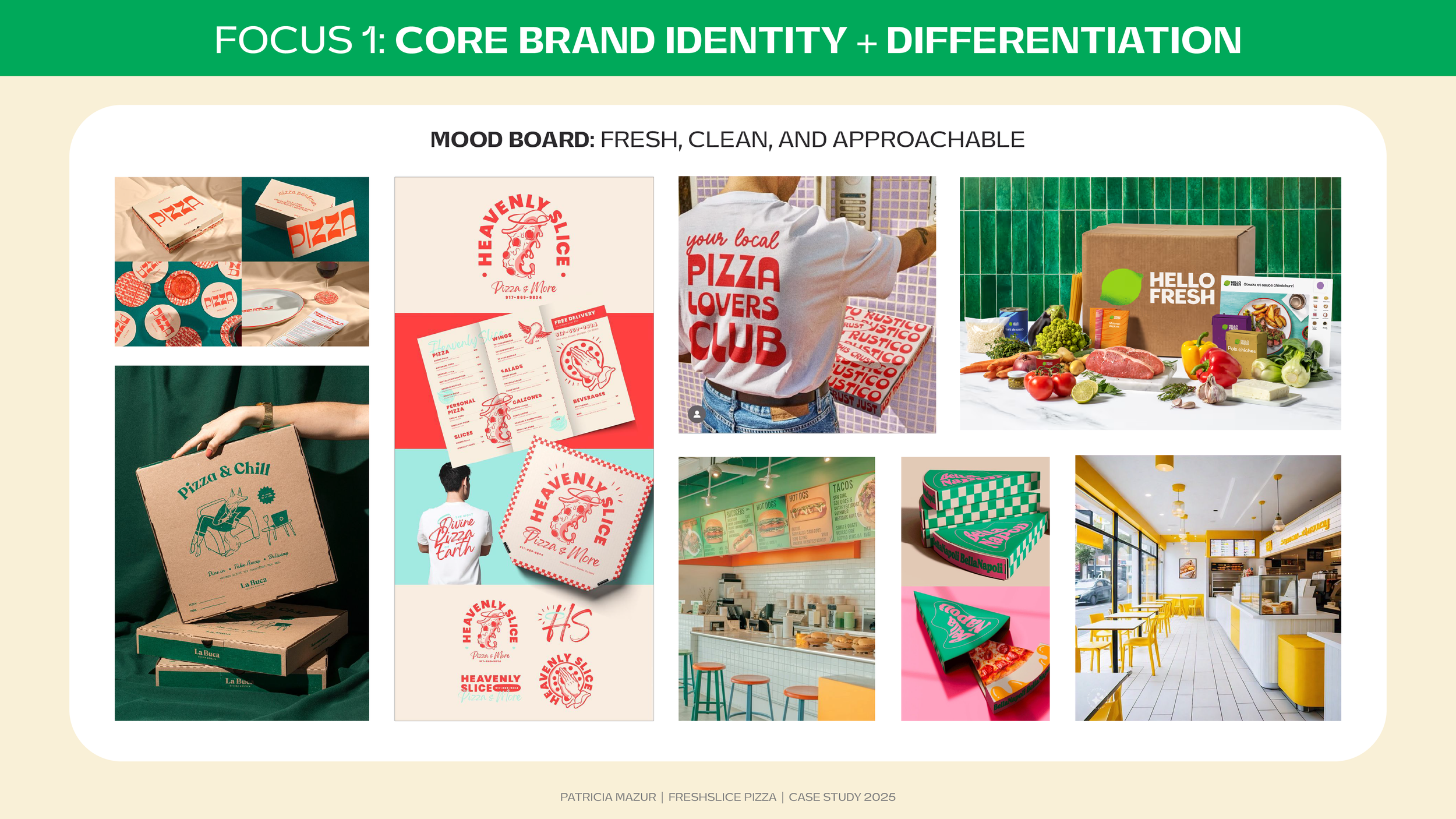
Mood Board
Researching visual inspiration helps to understand trends and explore concepts and ideas for the Freshslice new brand identity.
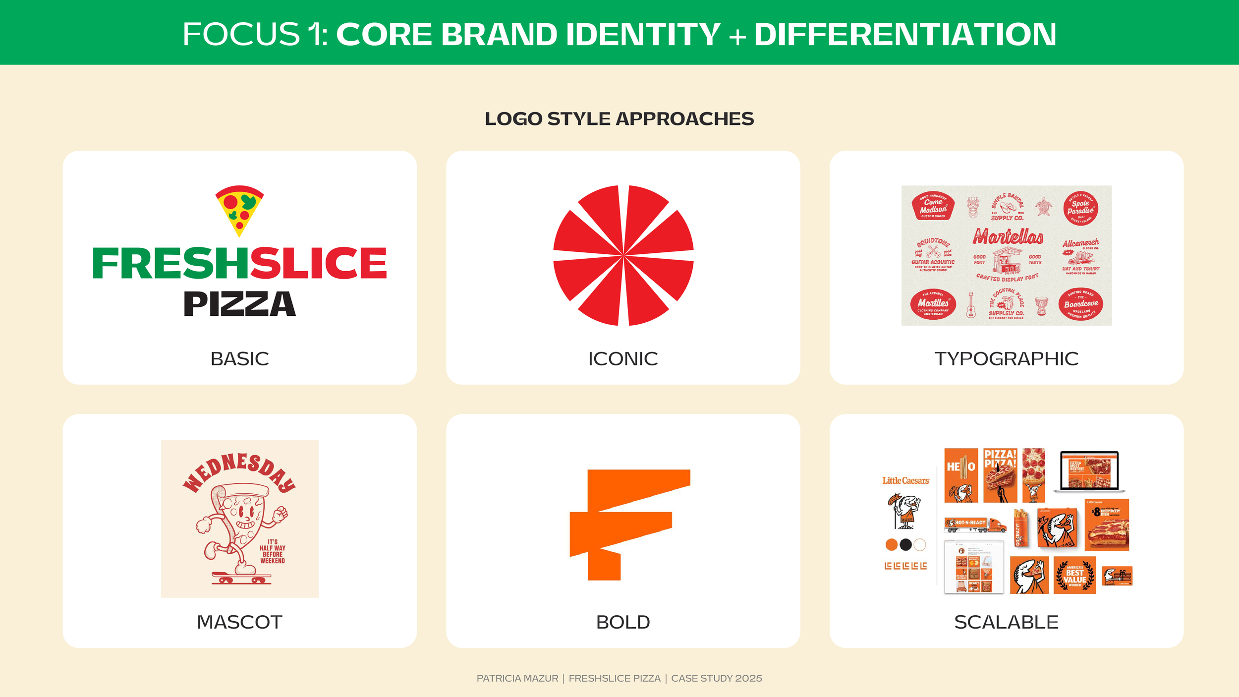
Logo Style Approaches
There were 6 concepts that I explored during my research. In the end, I focused on a blend of a bold, iconic, scalable logo approach.
Logo Design
The logo developed is clean, bold, and differs from industry competitors with its green leaf logomark.
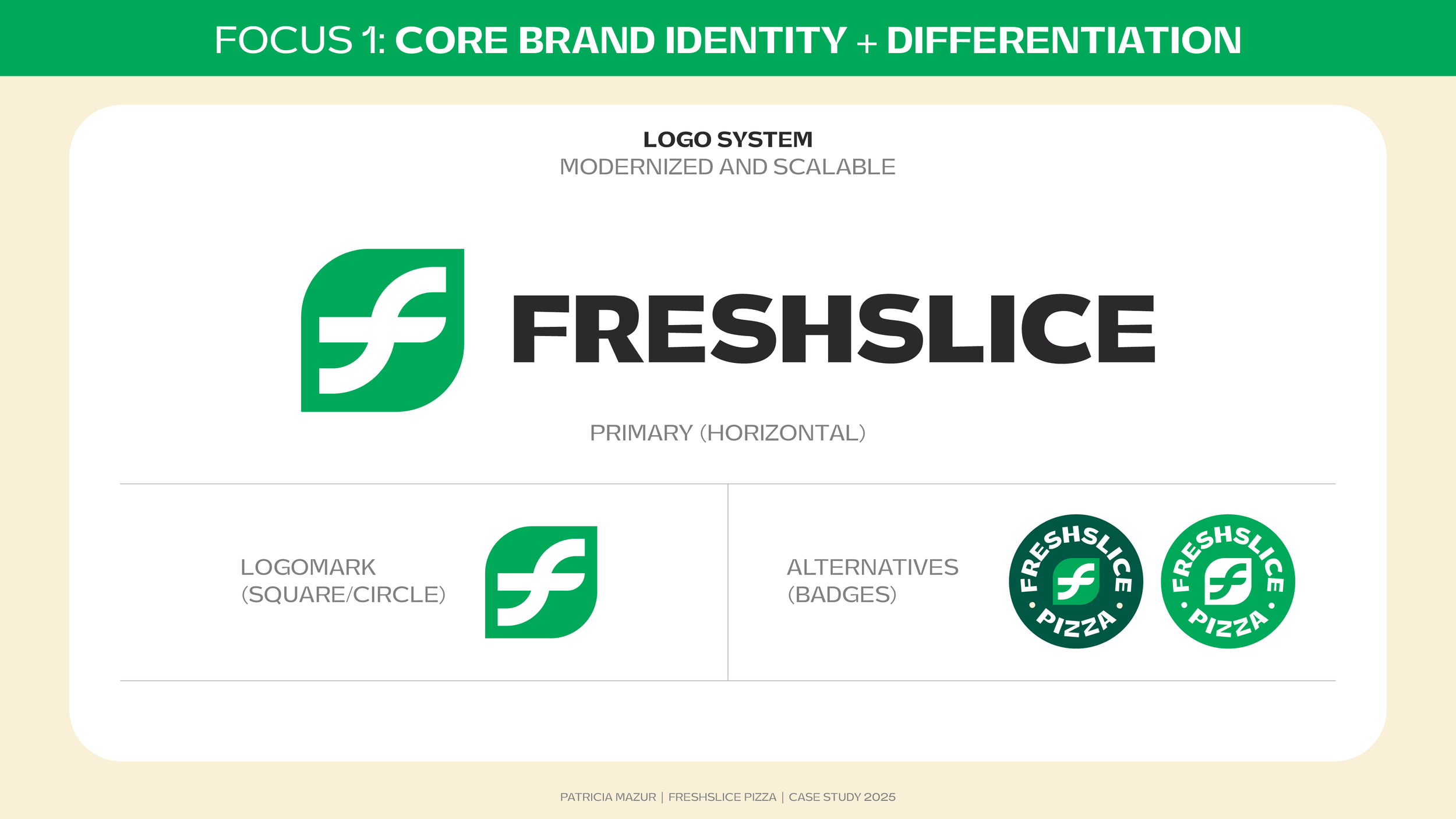
Logo System
Designing a logo system that is both versatile and scalable is necessary for Freshslice’s brand evolution.
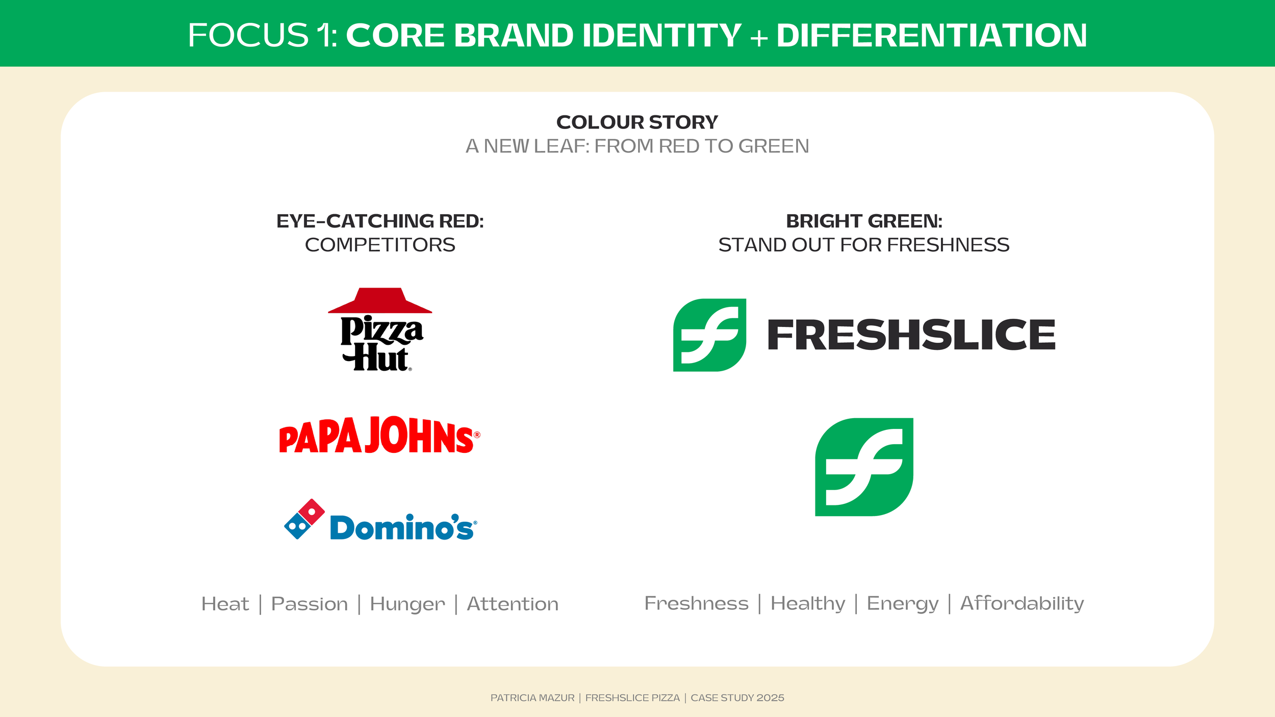
Colour Story
Red is a strong and classic colour used by competitors in the pizza industry. It was a strategic choice to further differentiate by selecting green as the primary brand color for Freshslice.
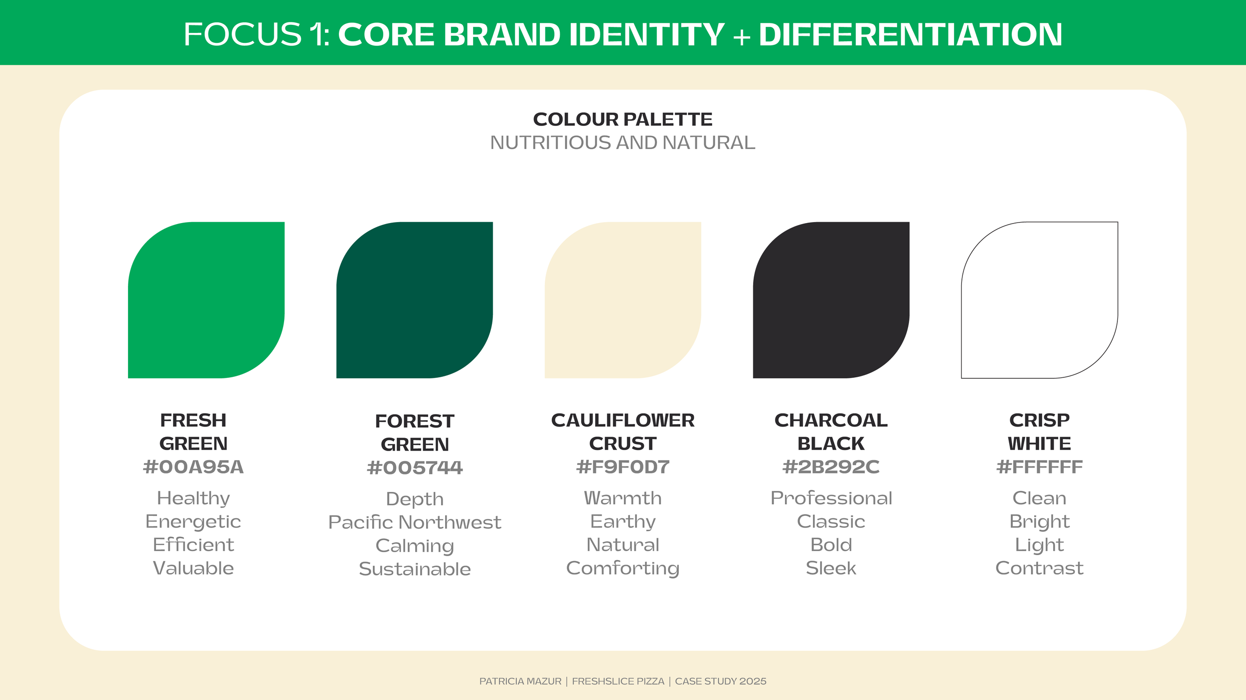
Colour Palette
The use of green brings freshness and energy in an otherwise saturated market. Green also references the lush greenery of Vancouver (where the brand is founded), and the nutritious, healthy Freshslice ingredients.
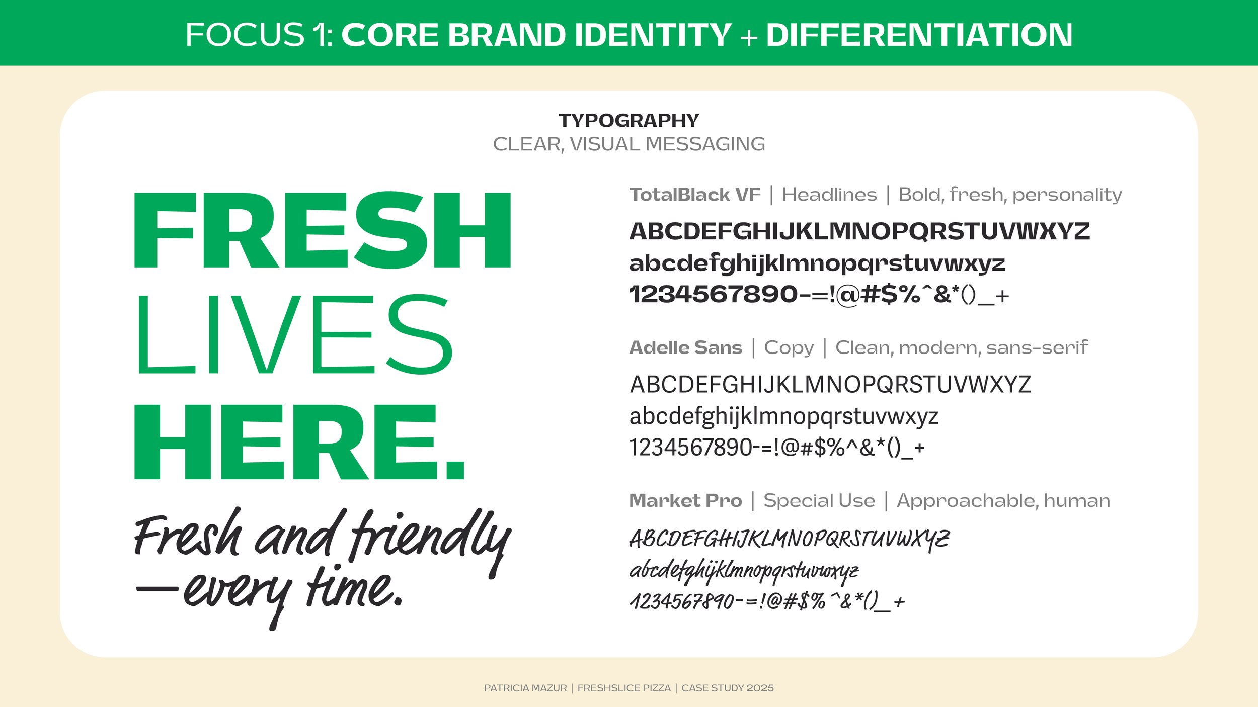
Typography
The contrast of big, bold headlines, clean, legible copy, and bouncy script blends both the professional and approachable personality of Freshslice.
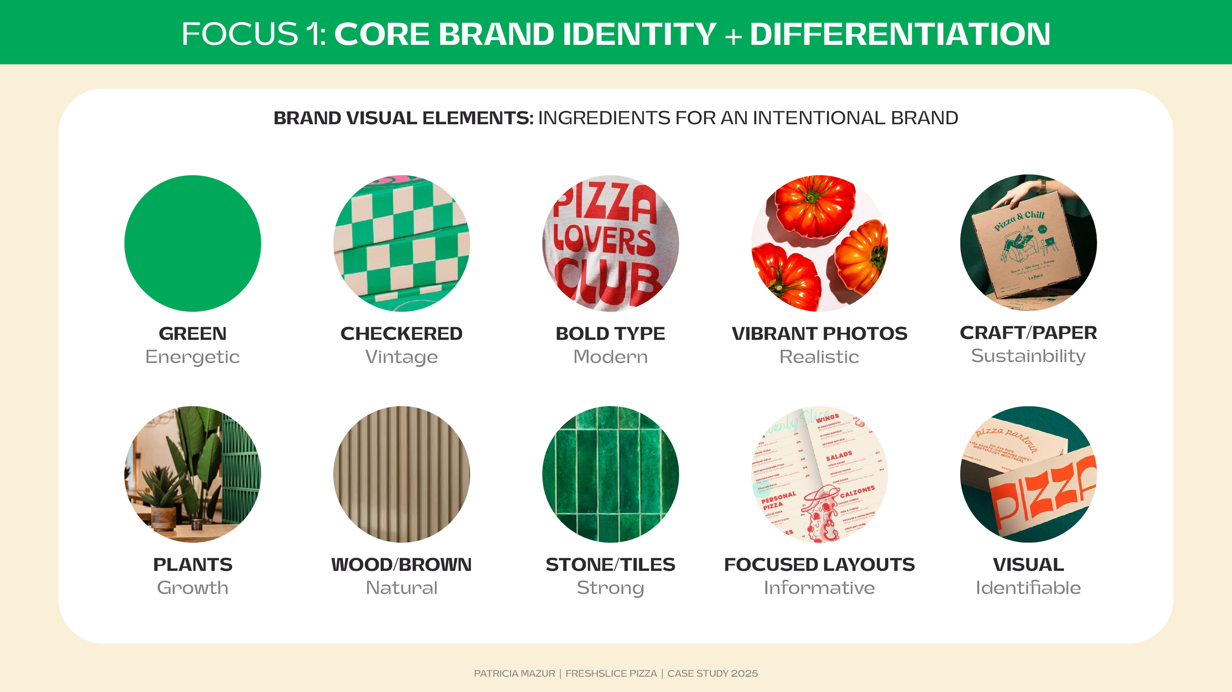
Brand Visual Elements
Identifying specific elements that elevate and balance the overall brand visual identity is like developing a special mix of toppings for a delicious pizza.
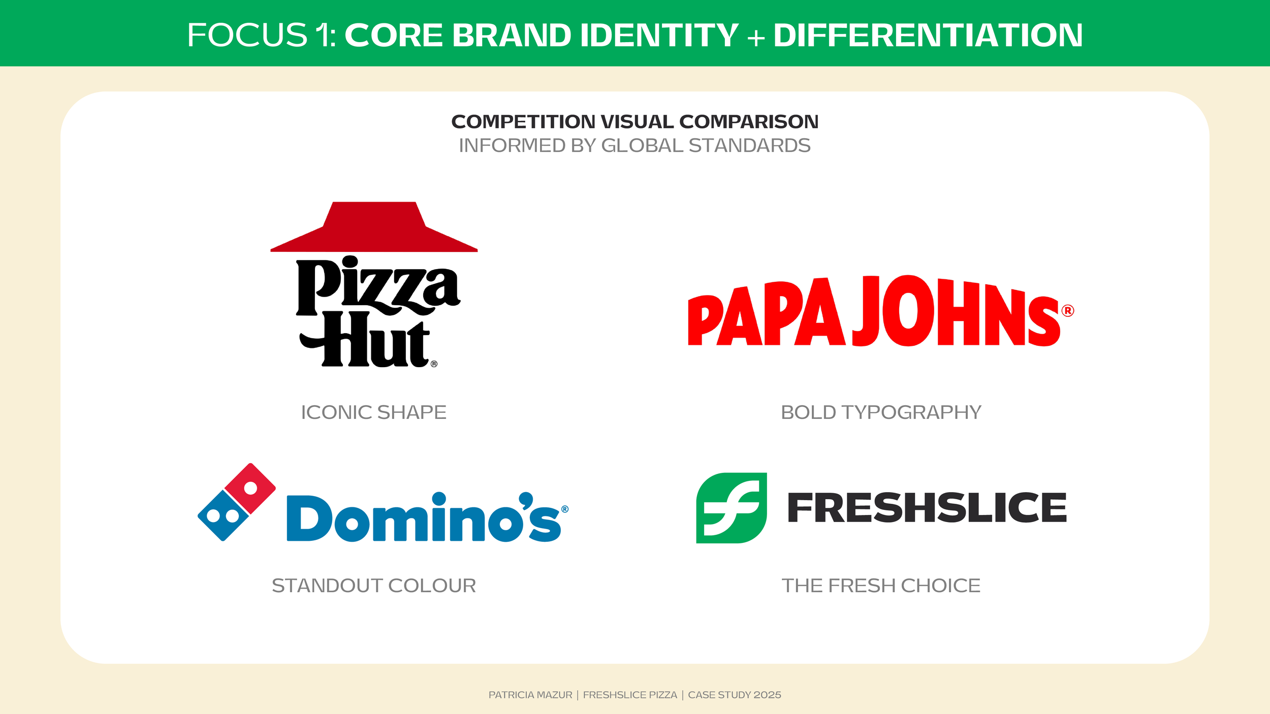
Competition Visual Comparison
Researching and referencing competitors enhances how best to visualize and market Freshslice’s unique value proposition of a fresher, healthier pizza selection.
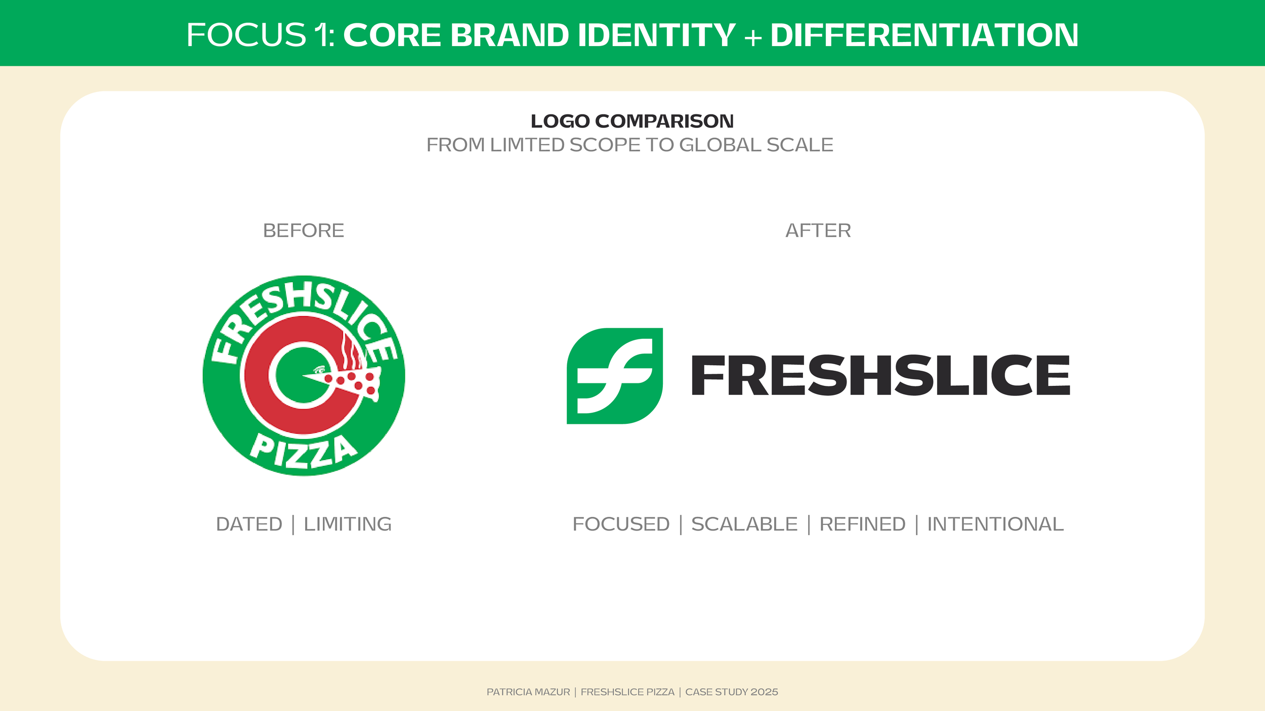
Logo Comparison
Contrasting the current logo to the proposed logo developed highlights the improvements in design, aesthetic, and style.
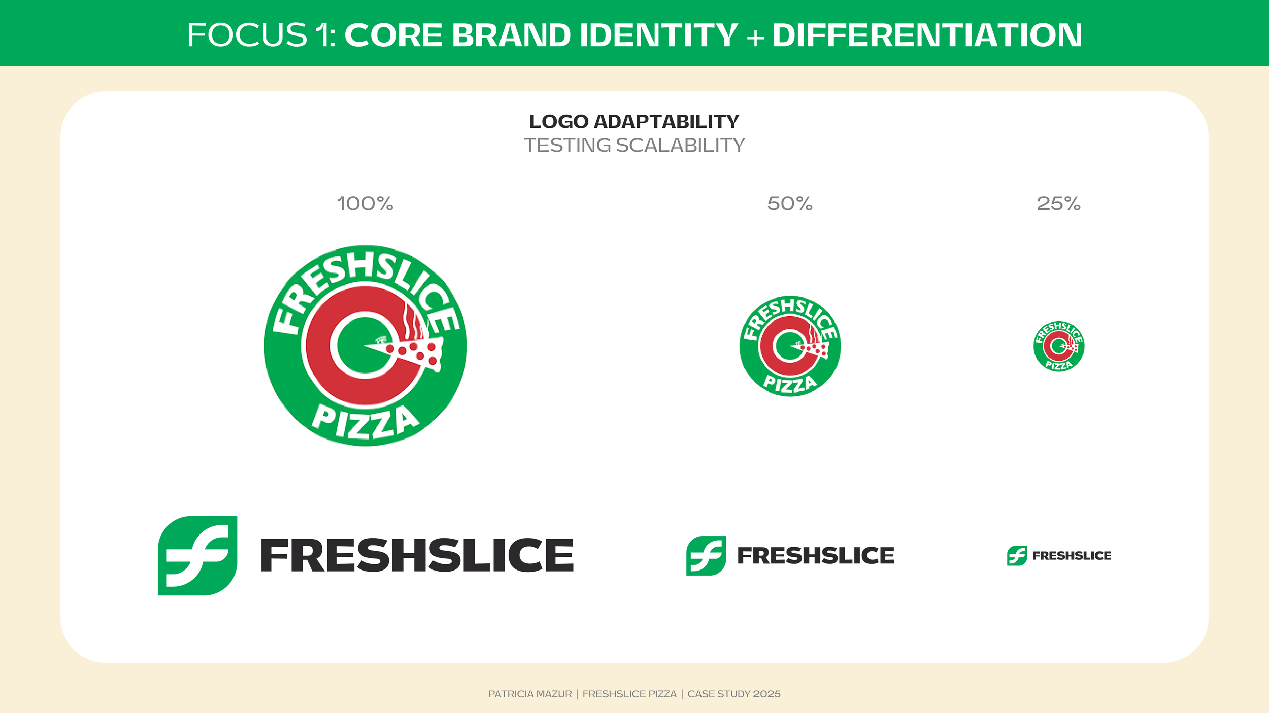
Logo Adapatability
Testing for scalability between the two logo options showcases how the updated logo has better legibility and clarity when scaled smaller.
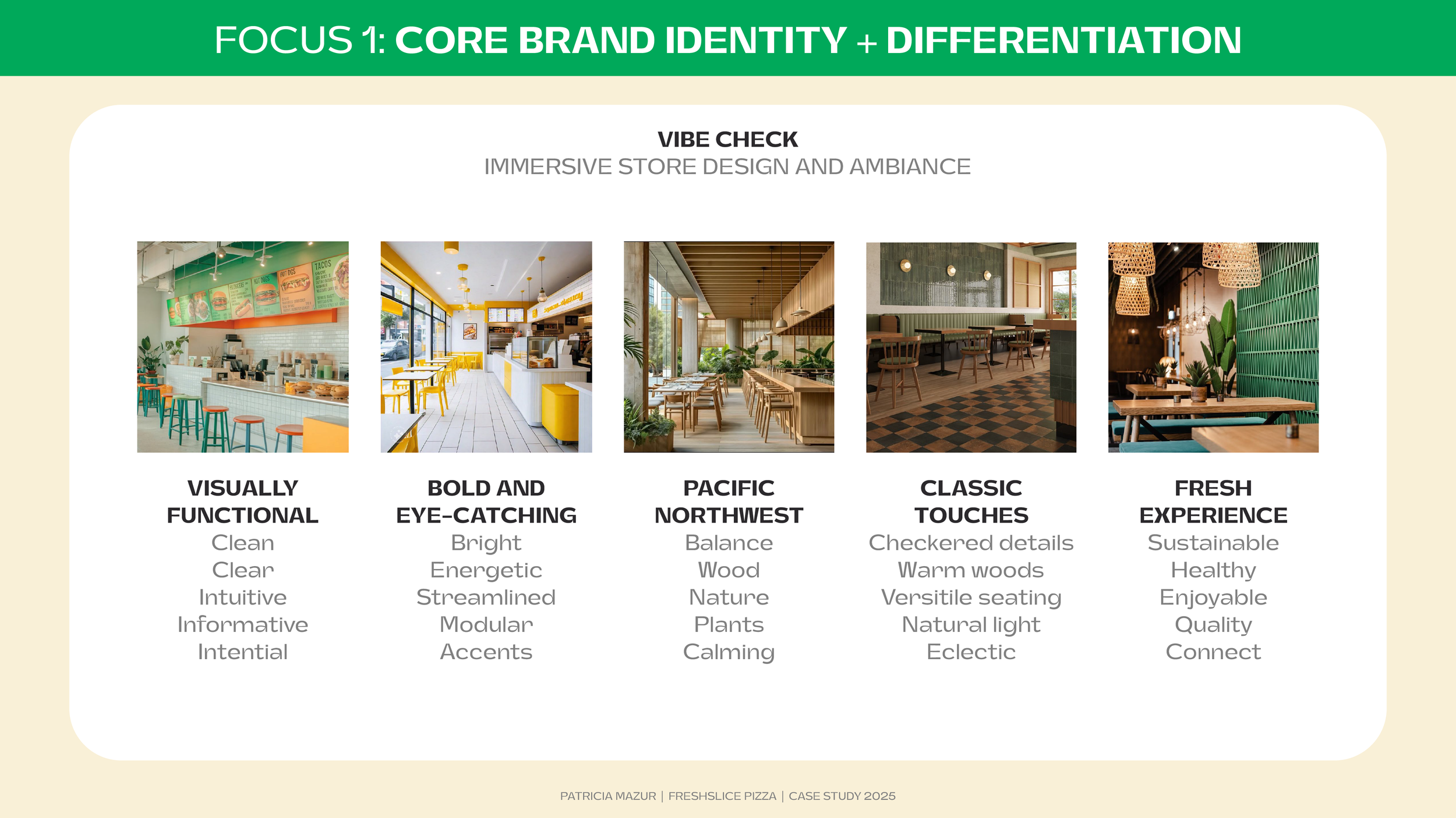
Vibe Check
Connecting brand visual elements to the store design to create a unique perspective on convenience with greenery, natural elements such as woods and stones for a calmer, refreshing, and enjoyable space.
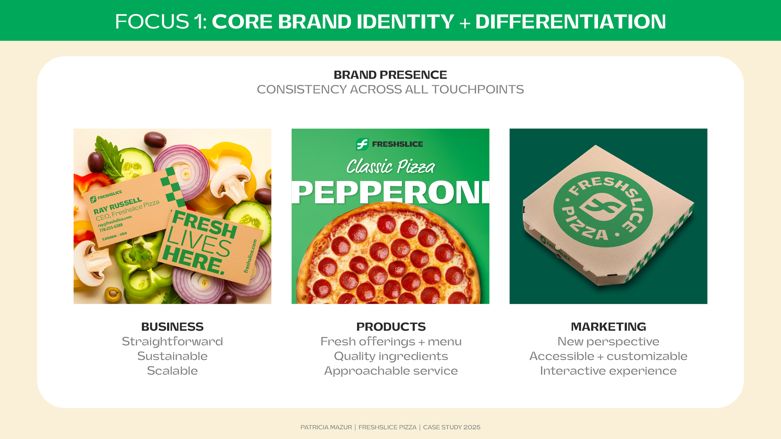
Brand Presence
Translating and applying the brand elements into a refined and competitive visual brand identity system results in a focused, intentional, and exciting brand update.